Sitch – Lyon & Lyon

Approach

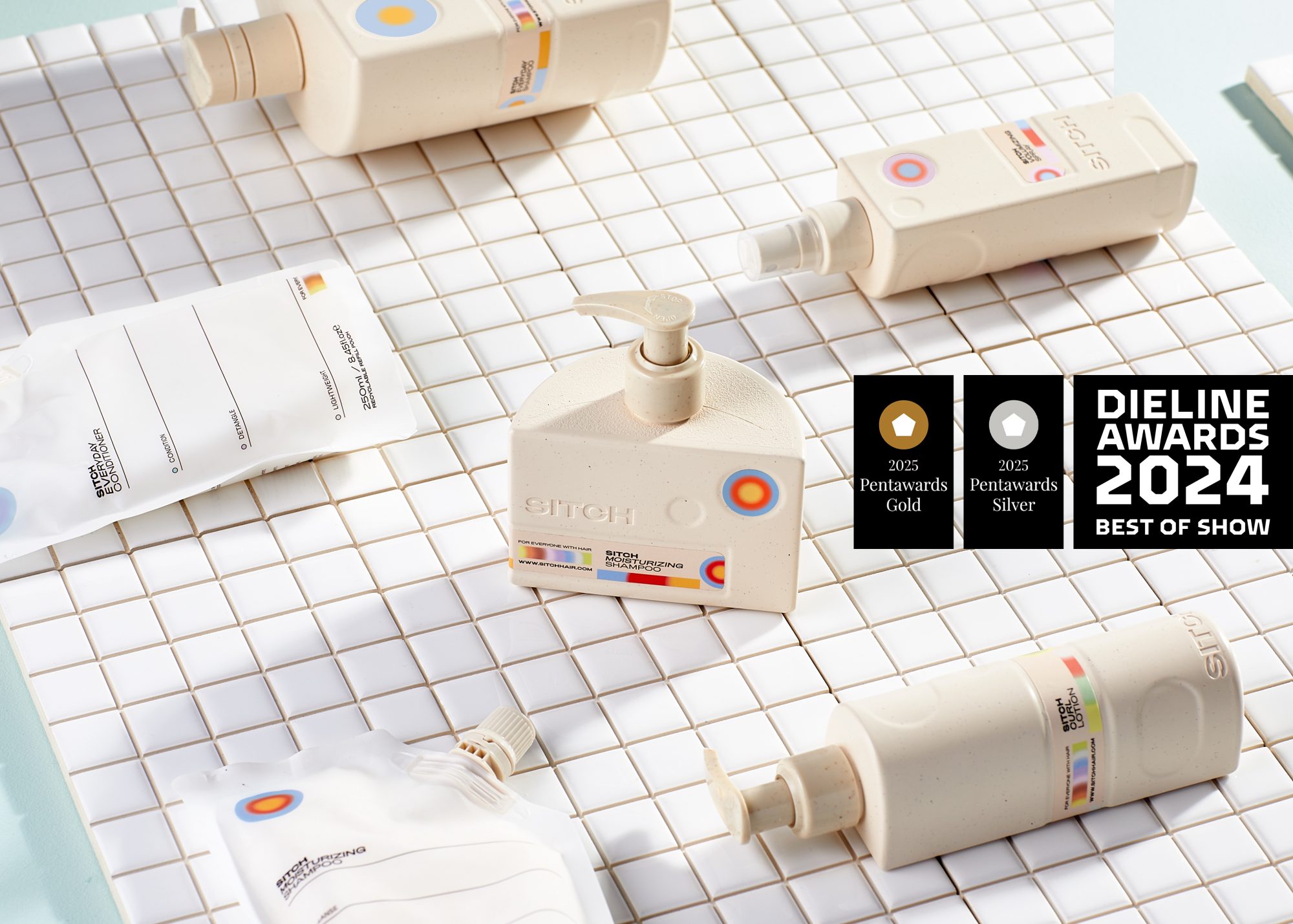
Sitch are simplifying the hair care world. Their salon quality hair products are colour coded to give you a guiding hand picking out the products you need.  The refillable bottles tessellate perfectly, they’re made to be used together so we made sure they live together. Undeniably perfect for merchandising in salons and stores.

No jargon, no mane shaming,
Forget excess bottles in the bathroom cabinet, strip back on the steps

Concept

The concept for Sitch branding and packaging was function forward, while the results are far from forgettable, the journey was totally rationalised. The flat backs are perfect for placing against the shower wall. The bullseye gradients represent the core properties of each product… Need hydration?

Story

Stick to the deep blues. Sitch prioritises cutting back on excess, no more forgotten products in the cabinet. We followed the same principle with the design, no excess details needed. The customer journey was prioritised throughout, keeping their decisions quick and easy. Then simply rinse, refill and repeat.
Sitch
CREDITS:
Design:
  • Lyon & Lyon
Photography:
  • Nigel Barker
Striving for authenticity
Purveyors of joy
Insert something deeply meaningful
Striving for authenticity
Purveyors of joy
Insert something deeply meaningful
Striving for authenticity
Purveyors of joy
Insert something deeply meaningful
Shopping bag is empty
Continue shopping