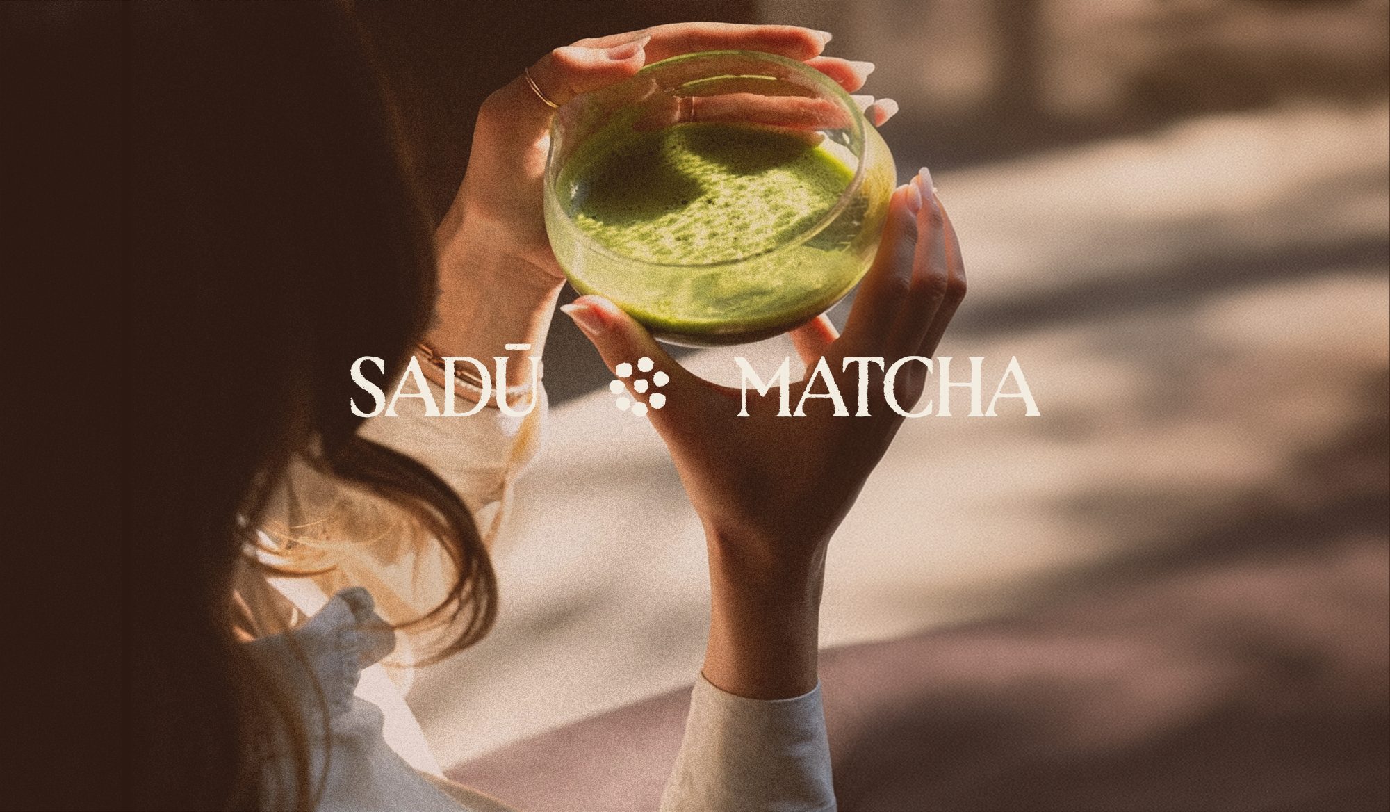
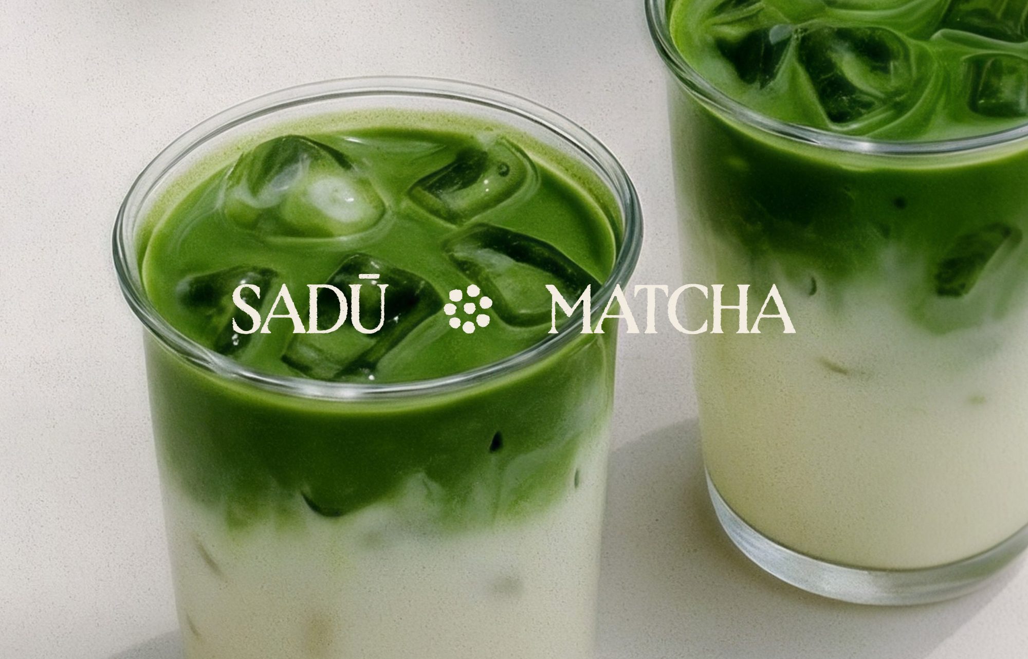
Sadū Matcha is a new café and wellness space in Borgo San Frediano, Florence. It brings together three things that don’t usually share a room: Japanese tea culture, Italian craftsmanship and Californian wellness.
BRINGING BALANCE TO A RITUAL
That mix comes from the founders. Romeo grew up in Tuscany, spent five years in New York and came home seeing Florence differently. Shayna is a holistic chef and nutritionist from LA who moved to Italy to start again. They met in Florence in 2023 and share one belief, that what you consume and where you consume it matters.
They wanted a brand that could hold all of that without feeling busy. Our starting point was a simple idea: bring a sense of balance to a ritual.
TWO CULTURES, ONE SPACE
We looked to two references.
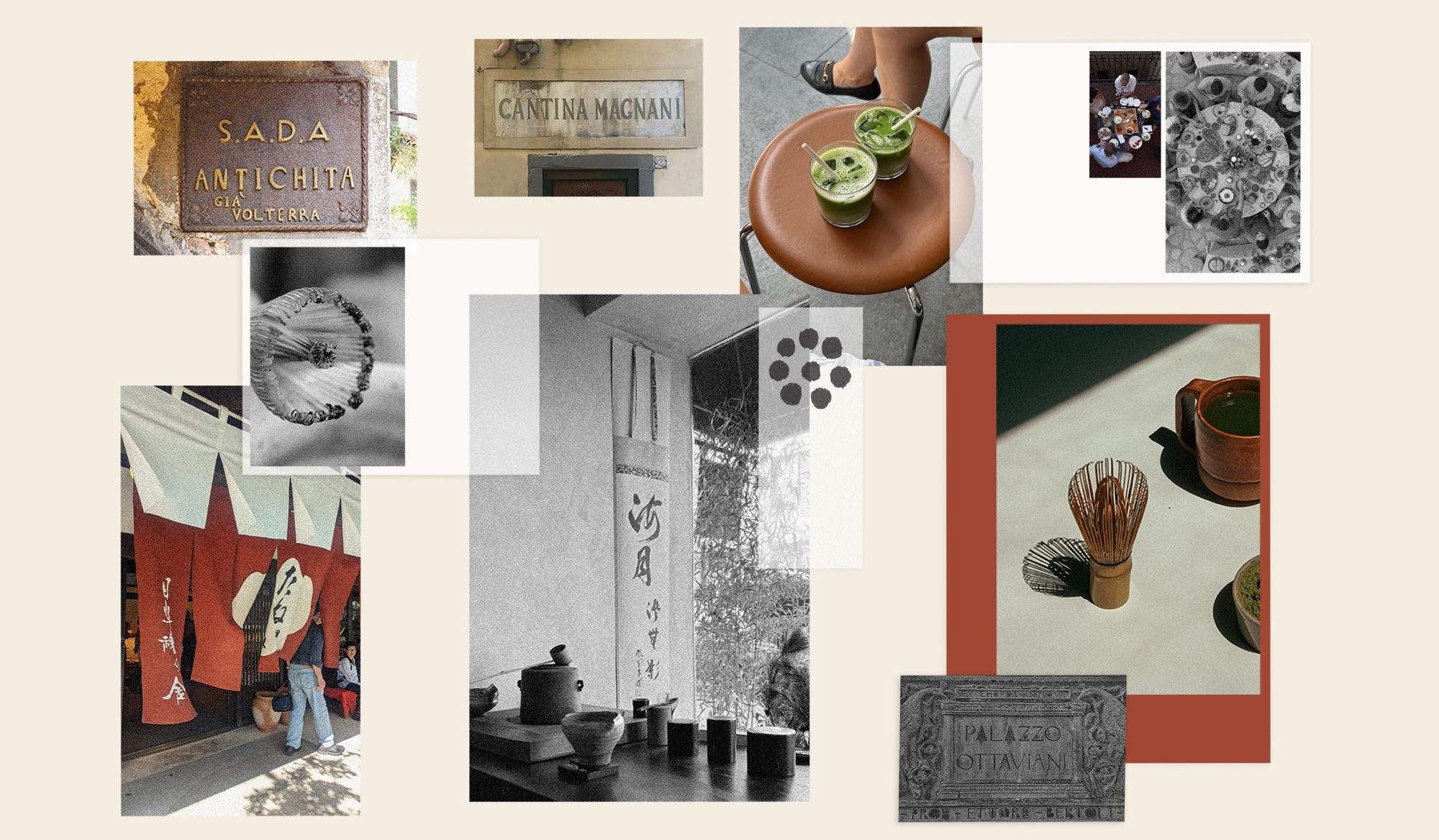
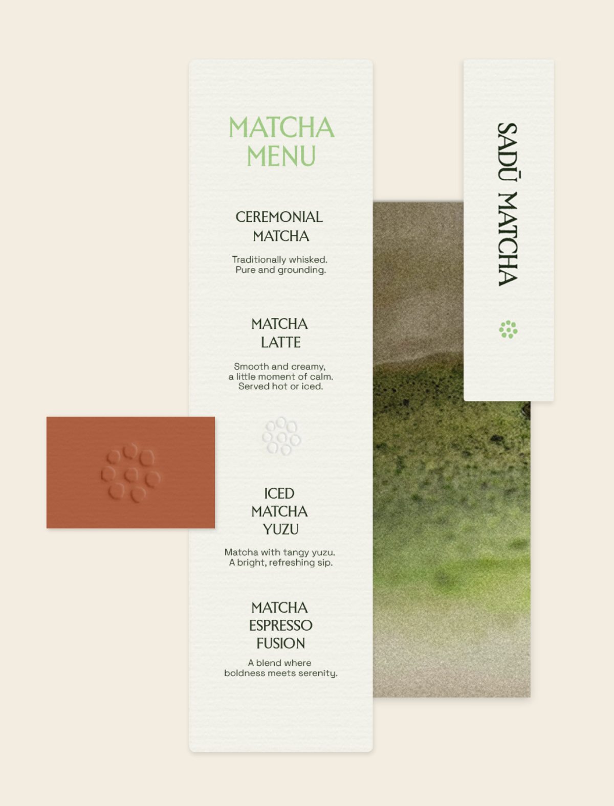
Japanese Noren curtains, the fabric panels hung in doorways to mark a threshold and welcome people in, gave us softness, space and invitation. Modernised Italian typography gave us structure and a quiet confidence that feels at home in Florence.
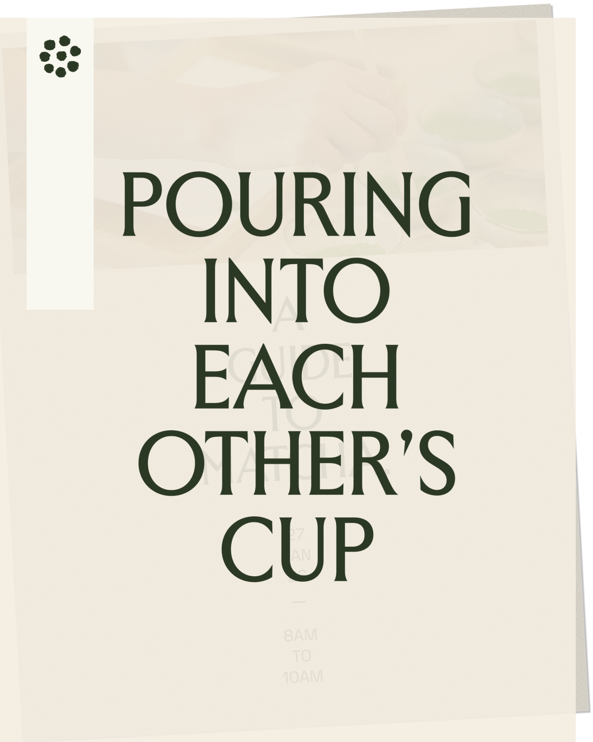
Together they create an identity that makes room for mindful space, time and wellness. The type works vertically as well as horizontally, echoing the way lettering hangs on a Noren, so the brand can move across [cups, packaging, signage, print] while keeping the same calm rhythm.
A whisk and a table
Sadū is built around connection as much as matcha, and the logo mark carries both.
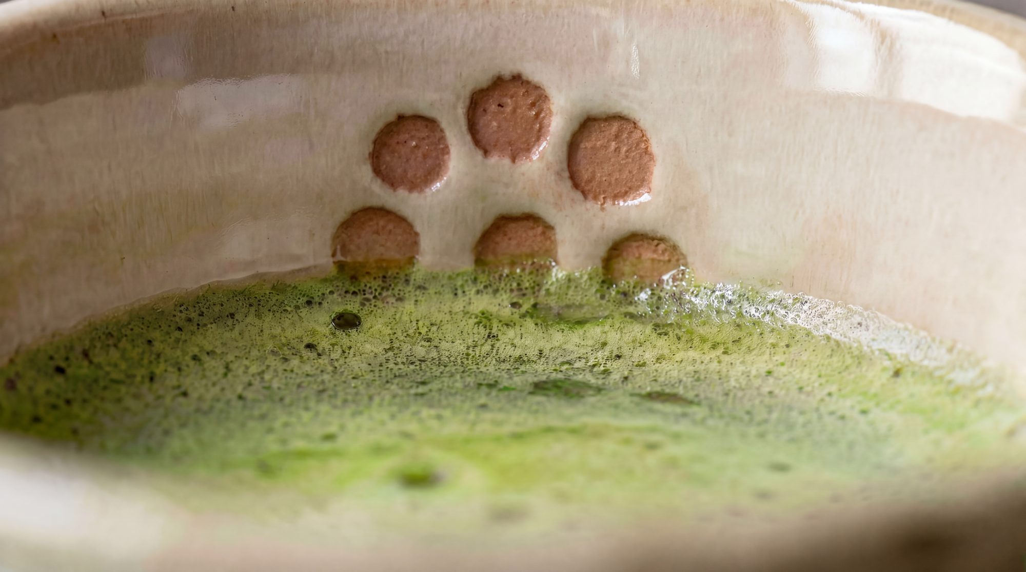
From above, a matcha whisk is a ring of fine tines around a centre. A group of people around a table looks much the same. The mark sits between the two, the tool of the ritual and the people it brings together.
MADE BY HAND
A brand about slowing down and human connection shouldn’t feel like it came off a screen, so we took the logo off one.
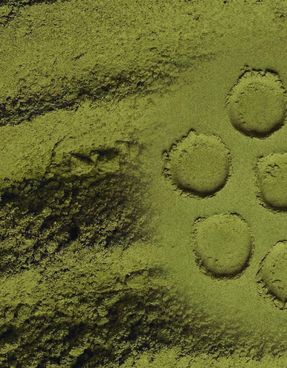
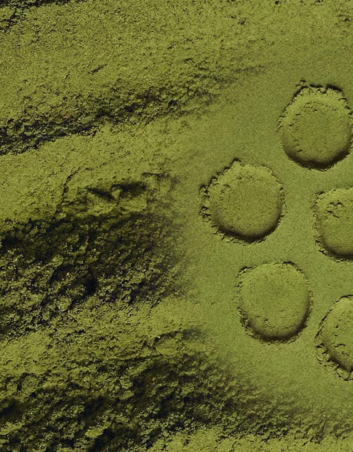
We 3D printed the digital mark, made it into a physical stamp and inked it onto paper by hand. Then we scanned, printed and rescanned the results over several rounds, letting ink, pressure and paper leave their marks.
No two impressions are the same. The uneven edges and gaps in the ink give the identity its warmth, and a feeling that someone made it with care.
Other News
See All News
We work with brands the world actually needs.
We don't invent stories.
We find the ones that were always there.
The product and the planet.
One story.
Brands the world actually needs.
We work with brands the world actually needs.
We don't invent stories.
We find the ones that were always there.
The product and the planet.
One story.
Brands the world actually needs.
We work with brands the world actually needs.
We don't invent stories.
We find the ones that were always there.
The product and the planet.
One story.
Brands the world actually needs.

